
VCC UI 2.0 has landed
We're happy to announce that a new major version has just been published. The focus for 2.x has been to clean up a lot of the old deprecated APIs as well as introducing new design for some components.
Thanks to the cleanup efforts being made possible by moving to a new major release we've managed to make to overall bundle size of VCC UI a lot smaller.
Notable changes🔗
- Redesign: Link Component
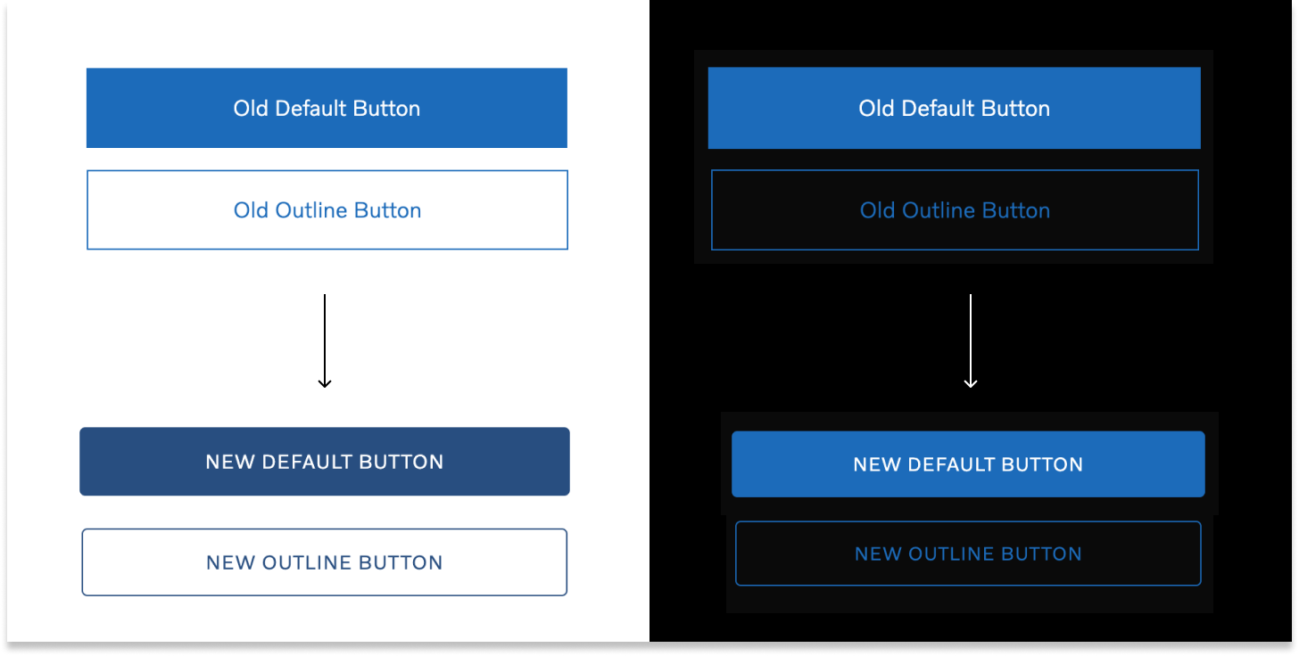
#387 - Redesign: Buttons
#383 - Bug Fix: Click touch action
#389 - Deprecation: unlabelled inputs
#380 - Remove deprecations
#374
API breaking changes🔗
Even though this is a new major release we've tried to break as little as possible this time, and if you've followed along with the deprecation warnings in 1.x you should be fine to upgrade without making any further code changes.
To help you upgrade, here's a list of the APIs that were deprecated in 1.x and have now been removed as part of the 2.x release:
Removed deprecated text styles
The jemison, ride, armstrong text styles have been removed as they are no longer in the design system. Note: The Volvo Serif Pro font is still accessible through the theme and shipped with VCC UI, should you need it to create your own style.
Removed Polestar theme
The Polestar theme has been discontinued as we had neither the resource, knowledge or support to keep it maintained. The themeability of VCC UI still remains intact and it would be technically possible to keep using the polestar theme, but you'll have to copy it from 1.x and maintain it locally in your project.
Removed innerRef prop on core components
The innerRef prop is now simply ref in Flex, Inline, Block, Click components.
Removed arrow, primary-light, iconAfter, iconBefore on Button
The <Button> component no longer has any animate arrows inside of it. The
intent="primary-light" was also removed in favour of intent="primary" rendered
with the dark theme.
Removed wordmark, wordmark-black logo types
The "wordmark" and "wordmark-black" logo types have been removed in favor of "spreadmark". Use the dark theme if you need the white logo on the black background
Removed altText from Logo component
Use alt="" instead of altText=""
Removed intent prop from Link component
Remove intent="primary-light" in favour of rendering <Link> using dark theme.
Removed options prop from SelectInput component.
You can now pass options to SelectInput by passing multiple <option> as children as you would do in HTML.
Removed variant prop for TabNav component
Remove variant="dark" in favour of rendering TabNav using the dark theme.
Removed TEXT_INPUT_TYPES for TextInput component.
Just pass a type as string eg: <input type="text"> as you would do in HTML
Removed isRtl option from styleRenderer function.
You can now set the "theme.direction" property before passing a theme to
<ThemeProvider>.
Removed Box component
The <Box> component was removed in favour of <Flex>
Trouble upgrading?🔗
As always: If you have trouble upgrading don't hesitate to reach out to us on Slack (#vcc-ui) or create an issue on our GitHub repository.