
Building themeable UI components
As part of the VCC UI 1.4.x release, we introduced a new theme: Volvo Dark.

The Dark UI Theme is generally used in two contexts:
- To create a more immersive marketing experience, sections of a web page can feature a "dark" theme.
- As a user adaptive setting: either manually preferred by the user or adaptive depending on the usage surroundings. For example: in low light conditions, when driving in the dark or in a tunnel etc.
Adaptive components🔗
This change means that all the UI components that we ship with VCC UI needs to be able to adapt to different themes.
Right now that means only colors, but in the future theme differences may also consist of brand variations or application context. For example: A marketing CTA button might be slightly larger than an internal enterprise application button, while still sharing the same core styles.
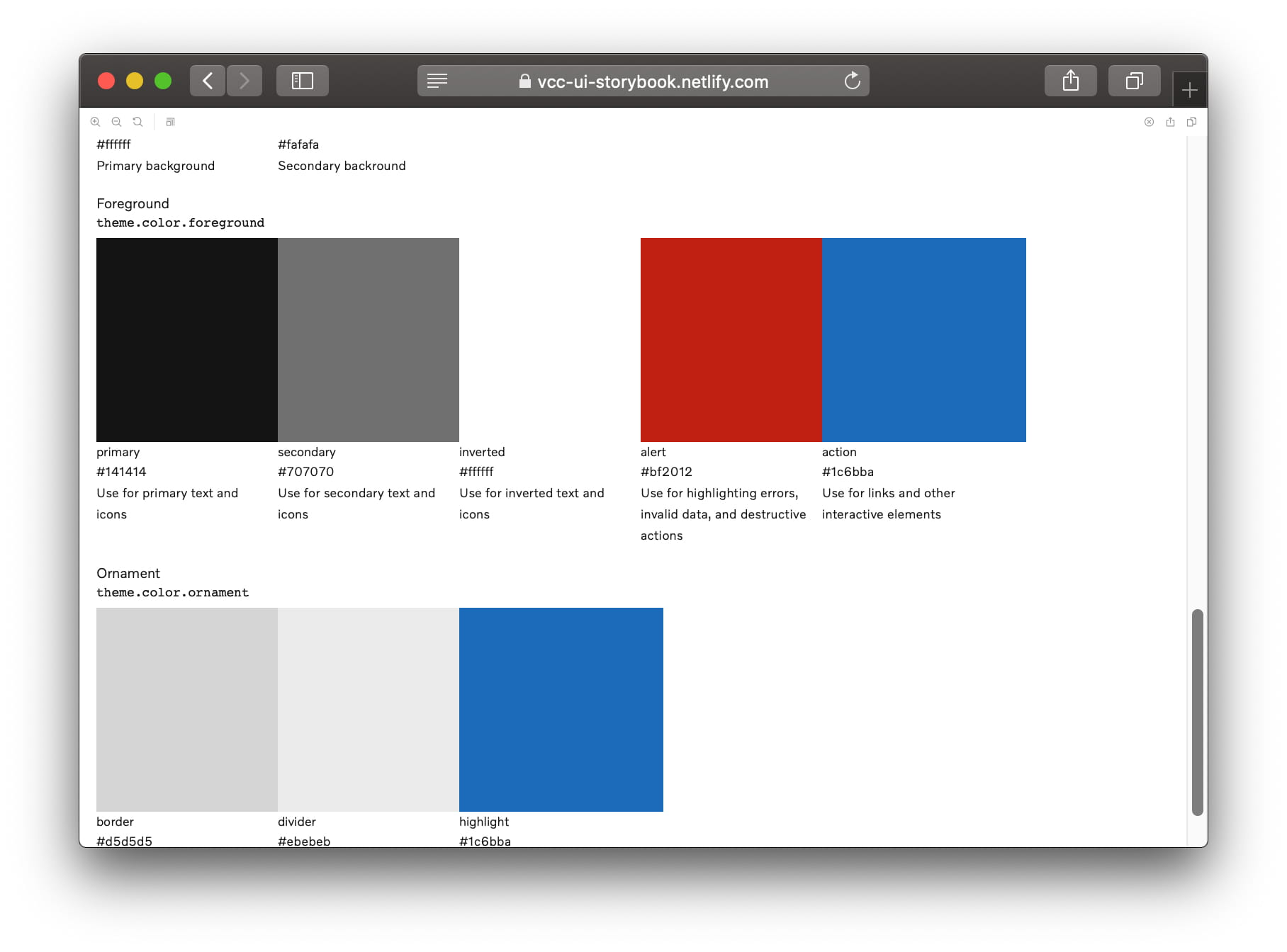
Theme colors🔗
Prior to 1.4.x colors were exposed via the theme object: theme.colors. In this
list you would find colors like: black, white, grey, blue etc.
Referencing these colors (as opposed to locally hard coding colors) solved the immediate problem of staying up to date with the theme. This does not scale very well though when building components that should potentially work across different themes.
Consider the following component:
This component will always render the almostBlack color on the ghostWhite
background. It's not going to adapt very well to be rendered in a dark theme.
To make the component truly portable between themes we introduced a new
abstraction that sits on top of the primitive colors. We call this abstraction decisions. A decision dictates how a color is being used within the current theme. The decisions that are shipped by default are categorised into: background, foreground,
and ornament colors.
Let's rewrite the previous example to be theme agnostic:
That's better! We can now render this component across themes without having to do any underlying code changes!
Our product designers will be using the same naming convention for decisions when they creating designs, this should help the hand-over process to developers. You can see the full primitive color palette and the list of decisions over in our storybook.